If you don't already follow my blog, posts on Twitter or Instagram, hello. My name is Ian Robson, and I'm an educator-researcher working in English Higher Education. I use visual methods to support engagement, participation and collaborative Sensemaking (Weick, 1995, Robson, 2020) in health, education and social care contexts. I am particularly interested in collaborative inter-disciplinary practice-learning-research. This blog is one of the places in which I document my own learning and development whilst doing this.
In this post, I offer a few of my draft propositions which (I think) underpin my visual practice, and a few examples of my practice that have acted as sites for experimentation and reflection. In offering propositions, it's not that I don't discuss my contribution in projects with others, but as I develop my practice, I need to re-state things. Over the last year or so, which has coincided with the global COVID-19 pandemic, I have tested the ambitions previously sketched out in this blog. Doing, as you may also have found, is one of the best ways of testing, refining and improving. My recent experience of doing in new contexts and at new scales has been both the most rewarding and infuriating experience of my career.
I'm currently writing an academic journal article which is helping me to see why the process has been both rewarding and infuriating. In the article, which I have completley re-written once already, I needed to face up to the facts that a) visual sensemaking is broadly embraced by those who are of different disciplines to me, but also b) the process and results have been mixed because (in part) I've not developed the dialogue and philosophical foundations for that work, so my collaborators are quite right to be confused. I don't mind a bit of confusion, but I want it to be productive in some sense.
Where do I (re) start? It's tempting to want to codify things, but what I need isn't to codify, fix, or create any sort of instrumental blueprint. I have reflected that my contribution (often in interdisciplinary health and social care research) it to activate new lines of enquiry, expand conceptual models and to materialise/mobilise learning. I am less interested in post-activity decoration, or illustration.
Like Erin Manning and Brian Massumi (2014)'s work on art, philosophy and activism, my objective in writing about what I/we do is to develop a set of propositions for collaborative doing/thinking. Like them, I am interested in getting attuned to the "what is happening now?" in situations, to activating others' responses to a trajectory of enquiry. I find it hard to write about this for scientific partners, and they have (quite rightly) asked me questions about what I mean.
I have previously started off by explaining my methodology as "not" the scientific method (i.e. with hypothesis, variables, fixed experimental conditions, 'findings', and the aim of reproduction), but that creates an unhelpful binary opposition which does not promote coming together, neither is is honest or taking ownership of my work. As it happens, it also does an injustice to the invention and subjectivity I have found is part of the scientific method (even if this isn't shouted from the rooftops).
So, ( I ask myself) on what basis can 'the visual' meaningfully connect the artistic and scientific modes of enquiry? My emerging propositions are in part informed by Manning and Massumi (2014). A proposition asserts some ideas, so I like to think of my propositions as 'offers' for agreement. In my case, I have found that relating, building trust, and finding common ground is the basis for any methodology to connect to new audiences. Therefore, I continue to work on propositions that can form a starting point and working principles for my contribution to a scientific project. Here's my work in progress:
- Provide terms of engagement: As much as it might seem tempting, simply producing 'attractive' or 'engaging' visual material does not add change the substance of research activity or scientific data. Collaboration, I think, is aided by some sort of protocol, which is what this list might become. This protocol or terms of engagement should help ALL who work with artistic visual contributions to direct their questions and contrubutions.
- Disrupt habits: My sense is that one way the artistic-visual can contribute to scientific dialogue is by promoting critical and reflexive inter-disciplinary enquiry. As thinkers like John Dewey and Karl E. Weick have famously pointed out, much learning starts when something stops 'working', or is somehow confusing or problematic. Put simply, artistic-visual practices can make subjects "strange", metaphorically 'turning them round' to appear other-than. As a minimum, I have found that this can move all participants out of habitual ways of working as they are forced to work out what they each see, making positions, assumptions and priorities explicit.
- Keep things moving. Inter-disciplinary diaologue, and specifically the development of shared/connected lines of enquiry does not 'just happen'. As Manning and Massumi (2014) found in their work in SenseLab/3Ecologies, such groups need to attend to creating "initial conditions" and "enabling constraints" that start, and sustain, events of "live" enquiry.
- Attune to emergence. Shared enquiry needs shared, or complementary/connecting questions if we want to avoid passive responses like "that looks interesting/nice". Again, in my practice, I have found that shared enquiry is most agile and focused when it is concerned with spotting 'cues' for shared Sensemaking (Weick, 1995). Being attuned to emerging patterns and sensitised to sites of activity in a field of data / visual phenomenon can have a powerful role in directing questions in the course of shared enquiry. What questions look like will vary according to the learning community, but they might take the form of questions like "what is changing?".
Three (example) experiments
In recent work, and work in development, I offer a few examples of how these propositions might (to different degrees) may have been present without formal articulation - a) as feedback loop, b) as iconography, and c) as an alternative mapping:
a) The visual as a feedback loop. In putting together plans for improved searching for scientific papers / evidence on 'fuzzy' subjects, and my visual contribution, a colleague asked if my work would act as a "feedback loop". This felt useful, to a point. I thought: can I take data and do something (visually) different with in so that outputs from the process, in turn, feed into mainstream scientific enquiry? In this approach, the 'something' is perhaps to relate data to other data (e.g. adding in lived experience, or contextual data), or to re-animate that data in speculative or imaginary ways. At this level, I enhance an existing (scientific) paradigm, but I don't turn up my nose at this, as this still has value, and is more likely to get funded by mainstream health grantmakers, let's be honest.
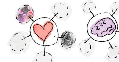
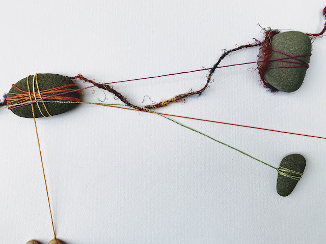
b) Playing with iconography. I have increasingly focused on foregrounding my use of visual notes. Some of these are useful for my reflective / reflexive work, but increasingly, these can 'break out' of my personal reflection and into colaborative work. At a simple level, I have found that others like to see my thinking behind positions, proposals or claims. For others, sharing playful sketches helped provoke questions or contributions in response. One example, still at an early stage, was provoked by my work in KERNEL, an early life research collaborative. My prompt was to address a conceptual 'itch' that had emerged for me as I woked with colleages across the collaborative. In short, it was something to do with whether I could describe a set of functions that might operate at different levels of description (e.g. concept, process, local practice). This remains speculative, a form of "what if?" that I have found to play one useful part in collaborative activity. When visualised, they are easier to review, select and apply in discussion. Put simply, a group can 'pick one' and playfully consider what it might be like at different levels (e.g. concept, process, activity). In other examples, I have been more playful, imagining an iconography as a form of proposition, or manifesto (see the second image below).
The third (of many) experiments offered as exanmple here is of an alternative imagining of the 'story' of health as it develops across the life course, again from my work in KERNEL. This work borrows from the traditions of design thinking and graphic design layout work, in that it is an attempt to show how an idea might look. I have found that materialising ideas is an extremely productive thing to do, nto least for myself, as it makes be be explicit about some things, and in other respects, visual elements can prefigure an explanation not yet developed (so in drawing a line or circling something, I am reaching towards an idea to be discussed).


No comments:
Post a Comment